REFERENCES
Don't hesitate to share a lot of references, the more, the best !
But beware, too many references can also make things more confusing if they are not choosen properly or not explain correctly.
Good references will make everyone's day easier and happier so don't ignore this step !
CHARACTER
> You can send all the visual representation you have of the character, previous commission, or even your own drawing (yes even if you can't draw it still help !)
> If you don't have any images you can also write a good and detailed description of the character.
A text description is always a good idea, even if have images, a written description is always a plus to explain the character's personality, the way he moves, talk, behave, etc...
ENVIRONEMENT
> You can send all the visual representation you have of the environement.
> If you don't have any images you can also write a good and detailed description of it.
STYLE
> The style can be how stylized is the drawing
> How do you want the line to be : super clean, sketchy, crayon look, super straight lines very squarish, very bold, very thin, etc..
> How do you want the coloring to be ? do you have a color palette in mind ?
> How do you want the shading to be ? simple shadows and a light source, simulate materials with more detailed, etc..
It's okay to use different references for everything :
for colors, for the stylisation of the character, for the lighting and ambiance, for the level of details of the background, etc..
BUT
Only one per categories.
For instance if you choose a reference photo for it's lighting/ambiance then don't send other references for the lighting/ambiance. By sending more you just make things more confusing for me.
Reference can come from anywhere you like :
My own drawings, other people drawings, your drawings, movies, painting, photos, whatever as long as it's only one per category !
Just don't forget to explain correctly wich reference is for what so I don't misinterpret it...
Here is an exemple of what a clear commission request would look like :
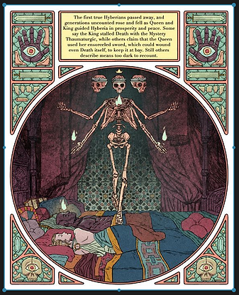
For the compositon with the main drawing in the cirlce and the graphic elements arround

For the stylisation / line / simple shading almost flat colors
For the green foggy lighting/ambiance, the use of strong black shapes and the main colors : greenish/yellowish + black + some touch of red
I would like an illustration of my OC Bob, standing in the forest on his gard, scared, waiting for something to potentialy come out of the woods to get him. The mood is uneasy, scary, unsettling.
Bob is a middle aged knight, who's realising that the mission he was sent for is way more darker and dangerous that he have been told. He he is very scared but he is aslo very much fucked anyway, so he is trying to find the strengh to fight back and survive
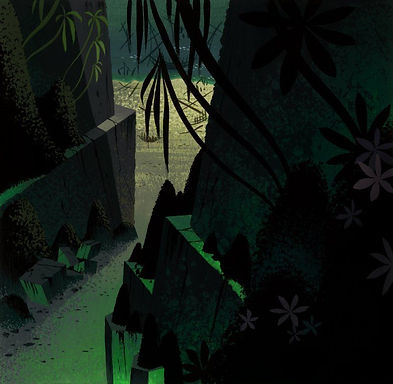
For the background level of detail
The woods are strange and uncany, like in the feywild.
I imagine leaves and branches falling down the trees kinda like weeping willows but differents (shape, colors, ect, like a new species of tree).
Everything would be very contrasted and the forest would have strong shapes like a Michel Ocelot's art.
In my head the whole thing looks like a page of a dark fairytale.